AMBROSIA
SUMMARY
The Ambrosia app was created out of an identified need as the demand for online grocery shopping grew given the situation with the pandemic. I, among many living in Toronto, have turned to support local and especially, shops that promote a healthy lifestyle. Established in 1979, Ambrosia grew from a humble bulk food store to a well-known local grocer located in three different prominent neighbourhoods in Toronto.
Prior to the pandemic, I visited the store on a weekly basis to stock up on organic produce and items. The stay-at-home orders due to the pandemic along with the uncertainty of the situation shifted the attention of a lot of people around the world to seek alternative solutions such as curbside pick-up and home delivery.
When I went to Ambrosia's web page to find out if they had an online ordering system, I was taken back to discover that they only had a web presence with a simple form for customers to fill out for any online purchases. It didn't make for an easy submission as customers have to manually type in details such as: brand, quantity, specified weight, flavor, etc. So I decided to design an app that will become Ambrosia's gateway for their customers to browse and shop from their online store with ease.
DESIGN THINKING PROCESS
1 | Define
4 | Design
2 | Analyze
5 | Prototype
3 | Empathize

Design Roles
Product Designer
Researcher
Time Frame
June - Oct 2020
Deliverables
User Surveys
Market Analysis
User Personas
User Journeys and Stories
Wireframes
Prototypes
User Testing & Analysis
Tools
Adobe XD
Google Analytics
Google Survey
UsabilityHub
Microsoft Office (Excel & Word)
Maze
OVERVIEW
Most people prefer to spend less time performing the mundane tasks that could be simplified using a web or phone device which includes grocery shopping. This project’s objective is to introduce Ambrosia’s shoppers to utilize online ordering to reduce in-store traffic in the time of a pandemic but also spearhead its presence and competitiveness in the mobile and web platform against other commercial and big-box grocery stores
DESIGN FOCUS
1 | Establish digital app platform
2 | Straight-forward interface
3 | Simple-to-use app widgets
4 | Revamp Ambrosia's online presence
5 | Increase usability and profit
6 | Build competitiveness within industry
DISCOVERY
An in-person interview at Ambrosia stores would be the ideal method to conduct a research for the app and web designs based on common needs and desires for potential users. The project is based on conversations done with Ambrosia employees along with existing online grocery store app reviews as a point of reference for elements to incorporate and improve on.
I conducted a survey through Survey Monkey to scope out the market and design pinpoints for the app and had 27 individuals answer it. Here are some of the findings and the data that I summarized.
USER RESEARCH
Q1 | Is it more convenient to use your mobile device or the web device when you grocery shop?
Sometimes I'd like to browse on the web but most times, I'm on-the-go and it's easier on my phone.
If the app is simple and straight-forward, I'm more likely to use the phone cause I can do it anywhere!
Depends on the situation but I always have my phone with me so it's always accessible.
I personally like to go to the store, pick up the item and physically see it.
I do everything on my phone. Even groceries.
Q2 | What grocery apps do you use currently, if any? What makes it appeal to you?
Grocery Gateway. I'm a loyal Longos-shopper although I'd have to say that their app is confusing to use and is faulty at times (deleting my items!).
I alternate between Instacart and Voila. Instacart has a good selection of stores but Voila has higher-end products overall. I also prefer Voila's easy-to-use interface.
I used to use the Metro app but gave up after failed attempts to navigate through it. Now, I do my weekly groceries on Instacart. Much quicker, less scrolling, and more choices.
Hands down, the most intuitive app is PC Express. My first time experience with the app was pleasant and they've managed to fix all their minor glitches making my shopping easy.
I've tried a lot of apps: Metro, Voila, Instacart, Grocery Gateway. My preference is definitely PC Express.
Instacart is great for me and my grandmother for delivery. I do find it easy to use on my Android phone but not on my iPad. Seems to have glitches sometimes.
What I like about the PC Express is that it was so easy to use right from the get-go. The app runs smoothly and I can get what I need delivered or ordered for pick up anytime on my phone.
Based on my personal experience, I think PC Express is the most efficient. Pages are simple both on the web and on the mobile device.
I like using Instacart for variety of choices but for my older parents, PC Express seems to be easier to use for them on their tablets.
COMPETITIVE ANALYSIS
There are currently many grocery apps and web service made available to users for online ordering and delivery along with a click-and-collect system. The first step in this project is to identify the likes and dislikes of the existing platforms to determine how to approach the design.
Q3 | What features entice you to use a grocery app? What features deter you?
likes
Intuitive layout + navigation
Minimal clutter on pages
Item recommendations
Cart history viewing + reorder
Easy sign up
Private settings
Enhanced searching function
Convenient payment process
disLIKEs
Cumbersome sign up
Pop-up's
Blurry images
Lack of search function
Clutter on pages
No option to privatize profile
Missing features: reorder, product listing, settings, etc.
KEY FINDINGS
Based on the answers provided by 31 correspondents reveal the following data regarding current mobile phone usage for the purpose of grocery ordering. Survey was done through the use of Survey Monkey.
83.9%
of the respondents have used and/or are using their mobile device to order pick-up and/or delivery through a grocery app.
76.9%
of those who have used and/or are using grocery ordering app said they will continue to order grocery pick-ups and deliveries through the app.
88.5%
also said that they would prefer to shop local and organic if given the choice of a grocer that have an app that was set up.
INFORMATION ARCHITECTURE
The Information Architecture is based on the findings from the survey and competitive analysis research which includes: User Personas, User Stories and User Flows.
USER PERSONAS
Aileen Palsh
38
Marketing Director
Oakville, Ontario
Married

Fitness & Nutrition,
Holistic Living,
Online Shopping,
Design/Decor
Tech Savvy,
Social Media User, Early Adapter
Aileen is a health-conscious individual who wants and has the means to eat organic. She works full-time and spends a lot of her working hours on her phone and computer. She enjoys online shopping and is opened to the idea of ordering her groceries online through pick-up or delivery to save her time.
Being a busy individual, Aileen doesn't have too much time on her hands to go in-store or to different grocers for the best value or organic items. She is looking for a local grocer in her neighbourhood to provide her with the most efficient way of shopping.
Needs
Frustrations
USER STORY
I created a user story from the respondents’ answers to the survey along with the competitive analysis on WasteTO app. The user story will highlight the high-priority needs of a new user and a returning user.
As a new user,
I want to sign up and set up my profile.
I want to get groceries delivered.
I want to get groceries ordered to be picked up by me.
I want to browse the grocer's selection.
I want to eat organic.
I want to support a local grocer.
As a returning user,
I want to sign in.
I want to change my profile settings.
I want to look at the current deals.
I want to browse the new items.
I want to add items to my cart.
I want to review the past order history.
I want to select the time for delivery and/or pick-up.
I want to change the delivery address.
I want to see recommended items.
I want added features like a recipe corner.
I want to search for a specific item.
I want to see the total of my shopping cart.
BRANDING & IDENTITY
Since Ambrosia is already established with its own branding and identity, it would promote cohesion with its web and physical presence by using the same colour theme and design. I have included List Making and Moodboard as part of the Ambrosia app identity.
MOOD BOARD
Font Selection
Cambria was chosen for the font selection of the Ambrosia app as it is a very readable serif typeface that is very fitting for both title and body texts.
Developed by Dutch typeface designer, Jelle Bosma, Cambria is designed to have proportional spacing especially in low-resolution display screens which is suitable on mobile and web devices.

Colour Palette
The colour palette is based off the established branding of the Ambrosia logo and colour theme. I have chosen to create the Ambrosia app with the same colour cohesion to promote a unity with the existing presence.
Additional complementary colours include light grey, medium grey, black, and white colour schemes.
6F4873
Main
BCA1BF
Accent
E9E5E5
Accent
D7D8D9
Accent
9FA1A2
Accent
000000
Font

DEVELOPMENT
SIGN IN & SIGN UP
Sign In

Profile Settings

Sign Up | Steps 1 - 3


MAIN PAGES & MENU
Main Page

Side Bar Menu

Landing Page

Shopping Pages


LOG-IN & SHOPPING CART
Upon logging-in on the Ambrosia app, users are greeted by the Special Deals and Shop by Departments as our research has indicated that users tend to favour grocery apps that mimic the store!

SHOPPING CART
Shopping Cart | Scroll to View


Updating Quantity | Drop-down menu


RECIPES & CONTACT
Recipe Page | Tap to View


Contact Page | Toggle (Details + Hours)


STORE SEARCH & ADD TO LIST
Users can find the "Search Store" option in the menu to find what they're looking for to be added to their shopping list or directly to their carts.
FINAL PROTOTYPE
SHOPPING CART
SHOPPING LIST
MAIN PAGES
Main Page
Side Bar Menu
Landing Page
SHOPPING CART | Scroll to View
Updating Quantity | Drop-down menu


Shopping Cart | Menu

Shopping Cart | Checkout


Shopping List | Menu
SHOPPING LIST
New Shopping List
Drop-down Quantity


New Shopping List

Removing Item from List


Removing List

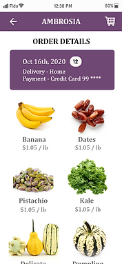
ORDER HISTORY
ORDER HISTORY

Order History | Menu

Order Details
RECIPES
RECIPES
RECIPES | Menu


Recipes Details | Tap to +Cart/+List


SIGN IN
SIGN IN

Profile Settings | Scroll to View


Settings | Menu

Sign Up | Steps 1 - 3
SIGN UP


SEARCH STORE
SEARCH STORE


Search | Menu

Search | Add to Cart

Search | Product Details - Toggle View


Search | Add to List

BROWSE STORE
BROWSE STORE


CONTACT STORE | Toggle to View

